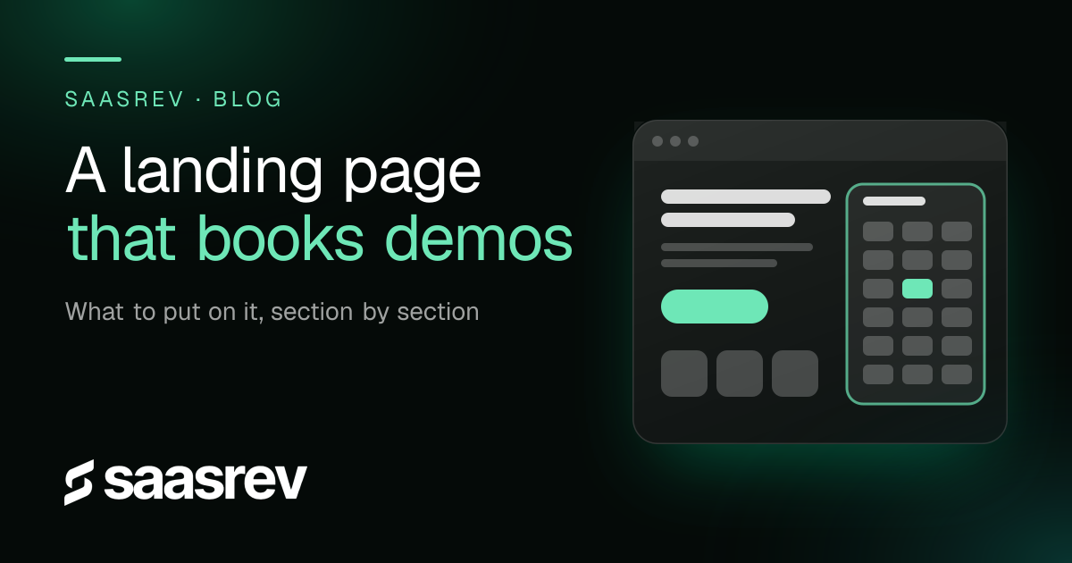
A B2B SaaS landing page that books demos needs one clear promise for one audience, proof placed next to the ask, a short form, a calendar on the page and a plain description of what happens on the call. Leave off anything that gives a visitor a second thing to do. This guide goes through the page from top to bottom, with what to put in each section and what to leave out, written for cold traffic from ads.
Who is a B2B SaaS landing page for?
For this guide, it is for a visitor who clicked an ad and has not decided anything yet. That visitor does not know you, and you are asking them to book time with a salesperson, which is a bigger step than reading a guide or watching a video.
Treat the page as the answer to one question: why should this person give you thirty minutes? Everything on it should help them answer that, and nothing else should compete for their attention. If you want the demo count to rise, the page is one of three levers, next to who sees it and who shows up, and we cover the full set in how to get more demos for your B2B SaaS.
What should the top of a B2B SaaS landing page say?
The top should say who the page is for, what they get and what to do next, in a few seconds. Write the headline as an outcome for a named kind of buyer, such as the result a RevOps lead or a founder wants, and not as a description of your product category.
A quick test: show the top of the page to someone who has never seen it for five seconds, then ask who it is for and what they would get. If they cannot tell you, rewrite it. Put one button in the top section, and make its label say what happens, such as "Book a strategy call" and not "Submit".
What proof belongs next to the call to action?
Real, named results, placed beside or just above the booking step, where a hesitant visitor is deciding. A visitor who is about to commit looks for a reason to doubt, and proof that sits right there answers the doubt at the moment it appears.
Use results you can stand behind, with the context that makes them believable: who the client is, what changed and over what period. If you do not have a result you can publish, leave the space empty instead of inventing one. A short, specific quote from a named person works better than a row of unnamed praise.
How many form fields should you ask for?
As few as you can route the call with. Name, work email and company is enough for most teams. Every extra field costs some bookings, and the answers to the rest can come up on the call.
If you need to screen out poor fits, a few qualifying questions before the calendar can help, with the trade-off that fewer people will complete the booking. That is a good trade when your sales time is limited. We cover how this works in what a VSL funnel is.
Should the calendar be on the page?
Yes. A buyer who is ready should be able to pick a time without leaving the page. Embedding the calendar removes a click and a page load, and both of those lose people.
Show real availability, and make the first open slot soon. A calendar whose first opening is two weeks away asks the buyer to commit to a future they cannot see, and the longer the wait, the more likely the call is missed. We go into this in how to reduce demo no-shows.
What should you say about what happens next?
Say it in plain steps. A short "What happens next" block, with three lines at most, tells the visitor what to expect after they book: when they will get a confirmation, who they will meet and what you will cover. It removes the fear of an unplanned sales pitch.
Add a short note on who the call is for. It tells good fits they are in the right place and lets poor fits leave without booking. A clear filter usually costs you bookings that were never going to be useful.
What should you leave off the page?
Leave off a second offer, a long grid of features, a full navigation menu that sends people elsewhere, and any section a visitor does not need to decide. Each one gives the visitor something else to do, and a visitor with two options can end up taking neither.
Page speed counts as well. Cold traffic from ads does not wait, so keep the page light, and test it on a phone, where many first visits happen.
How does SaaSRev's own booking page follow this?
Our booking page puts the promise first and the calendar right beside it. Next to the calendar is a short "What happens next" block with three steps, a note on who the call is for, and three client results. The case studies sit further down, for people who want more before they book.
We keep the main site header on it, so a visitor who wants to look around can, and the booking path stays the most obvious thing on the page. This layout is a choice that fits our offer, not a template for every page, and the way to know whether yours works is to measure it.
How do you know whether the page works?
Measure each step. Track the share of visitors who book, the share of bookings that show up, and the cost per qualified demo, for each ad or campaign that sends traffic. Change one thing at a time, so you know which change moved the number.
A page that books many calls with poor fits is not working, and neither is one that books few. The number that decides is qualified demos held, which is what the CAC math in how to lower SaaS CAC is built on.
Is there a real result behind this advice?
SaaSRev has published results from clients who fixed the path from ad to call. Instapatient had product-market fit but only two demos a week with no predictable rhythm, and went to 100 demos a month after SaaSRev built its acquisition engine. You can read more in our case studies.
That result comes from one engagement and depends on the company's product, market, budget and sales process. It is not a guarantee. See our Terms of Use for details.
If you want a second pair of eyes on your booking page, book a strategy call.
Frequently asked questions
How long should a B2B SaaS landing page be?
Long enough to answer the questions a cold visitor has before they will book a call, and no longer. For most offers that means a promise, proof, a short explanation, the booking step and a few answers to common objections. If a section does not help someone decide, remove it.
How many form fields should a demo request form have?
Ask only for what you need to route and prepare the call, usually name, work email and company. Published tests often report gains from cutting fields, though results vary by audience. You can ask more questions on the call.
Should I put the calendar on the landing page or send people to another page?
Put it on the page. Every extra click between the decision and the calendar loses some people, and an embedded calendar lets a ready buyer finish in one visit.
Should the page include a pricing section?
It depends on your offer. If price is the first question every buyer asks, say what you can, such as a range or what it depends on. If your price varies a lot, explain how it is set, and avoid a vague 'contact us'.